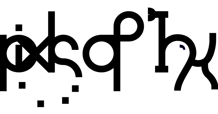

So the other day, as I was drawing some animals for a certain short story I thought to myself "I need a refreshed look for my graphic identity." I didn't really think it like that but, basically I started doodling out a more... complex/professional looking logo type thing for myself. After some tweaking I was really pleased with the whole bit. So today, when I got home from my meeting, and by home I mean my sister's house, I started to design it in greater detail. The "pixls of Ink" moniker came about in two different stages. First was the pixls bit which many if not all of you have grown to know and love. pixls is simply "pixels" without the "e," nothing really special but I'm like "so cool!" And I totally had it way before Super Paper Mario! Then the Ink part is all a bit more convoluted than you might think.
[The next paragraph is recommended only for lovers of linguistics and Greek, otherwise there'll be a summary afterwards, but read it anyway.]
This past year some friends and I started to learn Greek, and while that all didn't go very far we did learn the Alphbet very well (α β γ δ ε ζ η...) and so instead of actually speaking Greek (Ελληνικἀ :Ρ) we would just write things in Greek lettering and make things out of it (like Γριφον @griff48). So, much to my disappointment there is no "j" sound in Greek, that meant that there is quite no way to actually write Jake, or Jacob. Then from my one year taking Latin I remembered about consonental 'i's (McMichael would be proud). So I decided that combining the principle of consonental 'i's with the Greek usage of aspiration marks, I decided that an iota with a non-aspirated mark, or something like that, would henceforth be a "j" sound. From there I could spell Jacob iota-eta-kappa-omacron-beta (Ιηκοβ), or Jake iota-eta-kappa (Ιηκ). Then upon seeing that I thought "funky, that looks a lot like 'ink' dunnit?" (No I didn't actually think "dunnit"
Basically writing "Jake" in greek letters yields something that looks like the word "ink."
After that realization I thought it would be cool to combine the two pseudonyms into one. Thus, "pixls of Ink" was born.
In the new banner for the site I wanted to stick with the largely green-ish theme that I had going before but, when I ran out of nice-looking green colors I thought, "let's mix things up a bit." I'm not all that interesting a person so my idea of "mixing things up" is making the dot of the "i" a horribly different color. Though this be madness, yet there is method in 't! The point in making the dot a different color rather than other such bits was that I thought it would be kind of clever. "How?" you all ask confused and slightly ashamed. "Well..." I begin my reply. I thought that it looked quite a bit like a dead pixel on an LCD screen. The whole thing then comes together and joins geekity with design. Enjoy! Goodnight!


No comments:
Post a Comment